The Visual Display of Quantative Information
The Visual Display of Quantative Information by Edward Tufte
Summary
Last weekend I was browsing my local when I was pleasantly surprised to come across “The Visual Display of Quantative Information” by Edward Tufte. Despite the dry sounding title, it’s been highly recomendded to me. It’s a beautiful book to look at, and a very informative read.
Whilst common to us now, the idea of representating data in graphical format is a rather abstract one. Th book explores the history and significance of it’s development. Along the way, it presents some classic graphs and what makes them so good. These are distilled into fundamental ideas to consider when trying to represent data visually.
THe format of the book is notable for it’s clean and minimalist style. This is further conveyed by Tufte’s instructions to strip away the ink on the page.
What I learnt
- Each visualisation should have an intention. It should be clear to the reader
- It should be accurate and proportional. Charts have the potential to misrepresent the data in many ways. It’s your responsibility to avoid this.
- The representation of data goes beyond bar charts, pie charts and scatter plots. Think about the data you wish to display. These forms of charts are common, but more is always possible.
- Often less is more when it comes to charts. Every dot of ink on the page should have a purpose. Redundant ink distracts from your point. Clever use of ink can leave more information being conveyed by less ink.
Summary
This book warrants a re-read to extract all the learning. From my first pass, it’s made me consider displaying data beyond the process of deciding what chart type fits best, to how do I want to convey the data. Some of my favourite charts in the book are unique to the data they are presenting. It takes more effort, but it produces far better results.
Practical Examples
Included are a few practical examples inspired by the book.
First, let’s create a basic graph. As many have before us, we’ll use the diamonds dataset included in the ggplot library.
library(ggplot2)## Warning: package 'ggplot2' was built under R version 3.3.3library(dplyr)## Warning: package 'dplyr' was built under R version 3.3.3##
## Attaching package: 'dplyr'## The following objects are masked from 'package:stats':
##
## filter, lag## The following objects are masked from 'package:base':
##
## intersect, setdiff, setequal, unionstr(diamonds)## Classes 'tbl_df', 'tbl' and 'data.frame': 53940 obs. of 10 variables:
## $ carat : num 0.23 0.21 0.23 0.29 0.31 0.24 0.24 0.26 0.22 0.23 ...
## $ cut : Ord.factor w/ 5 levels "Fair"<"Good"<..: 5 4 2 4 2 3 3 3 1 3 ...
## $ color : Ord.factor w/ 7 levels "D"<"E"<"F"<"G"<..: 2 2 2 6 7 7 6 5 2 5 ...
## $ clarity: Ord.factor w/ 8 levels "I1"<"SI2"<"SI1"<..: 2 3 5 4 2 6 7 3 4 5 ...
## $ depth : num 61.5 59.8 56.9 62.4 63.3 62.8 62.3 61.9 65.1 59.4 ...
## $ table : num 55 61 65 58 58 57 57 55 61 61 ...
## $ price : int 326 326 327 334 335 336 336 337 337 338 ...
## $ x : num 3.95 3.89 4.05 4.2 4.34 3.94 3.95 4.07 3.87 4 ...
## $ y : num 3.98 3.84 4.07 4.23 4.35 3.96 3.98 4.11 3.78 4.05 ...
## $ z : num 2.43 2.31 2.31 2.63 2.75 2.48 2.47 2.53 2.49 2.39 ...diamonds %>%
ggplot(aes(x = carat, y = price)) + geom_point() +
xlab("Carat") +
ylab("Price")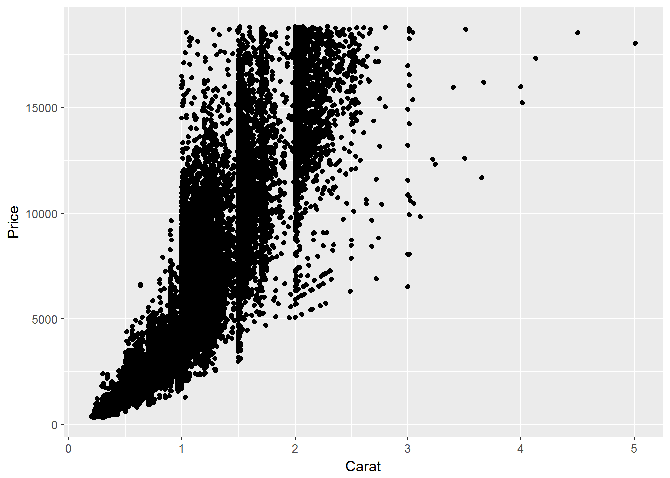
This is a solid chart. It displays the data, you can see the outlines of the dataset. But how could it be improved?
- The chart has turned into a mass of black. Whilst there is nothing wrong with black, it hides the true density of the points in it’s area. Can we better convey the relative density of points in an area?
- To do this, we could change the alpha setting to reduce overplotting. Alternatively, we could try a different method of representing the data, such as a density plot. For this example, we’ll reduce the alpha
diamonds %>%
ggplot(aes(x = carat, y = price)) + geom_point(alpha = 0.1) +
  xlab("Carat") +
  ylab("Price")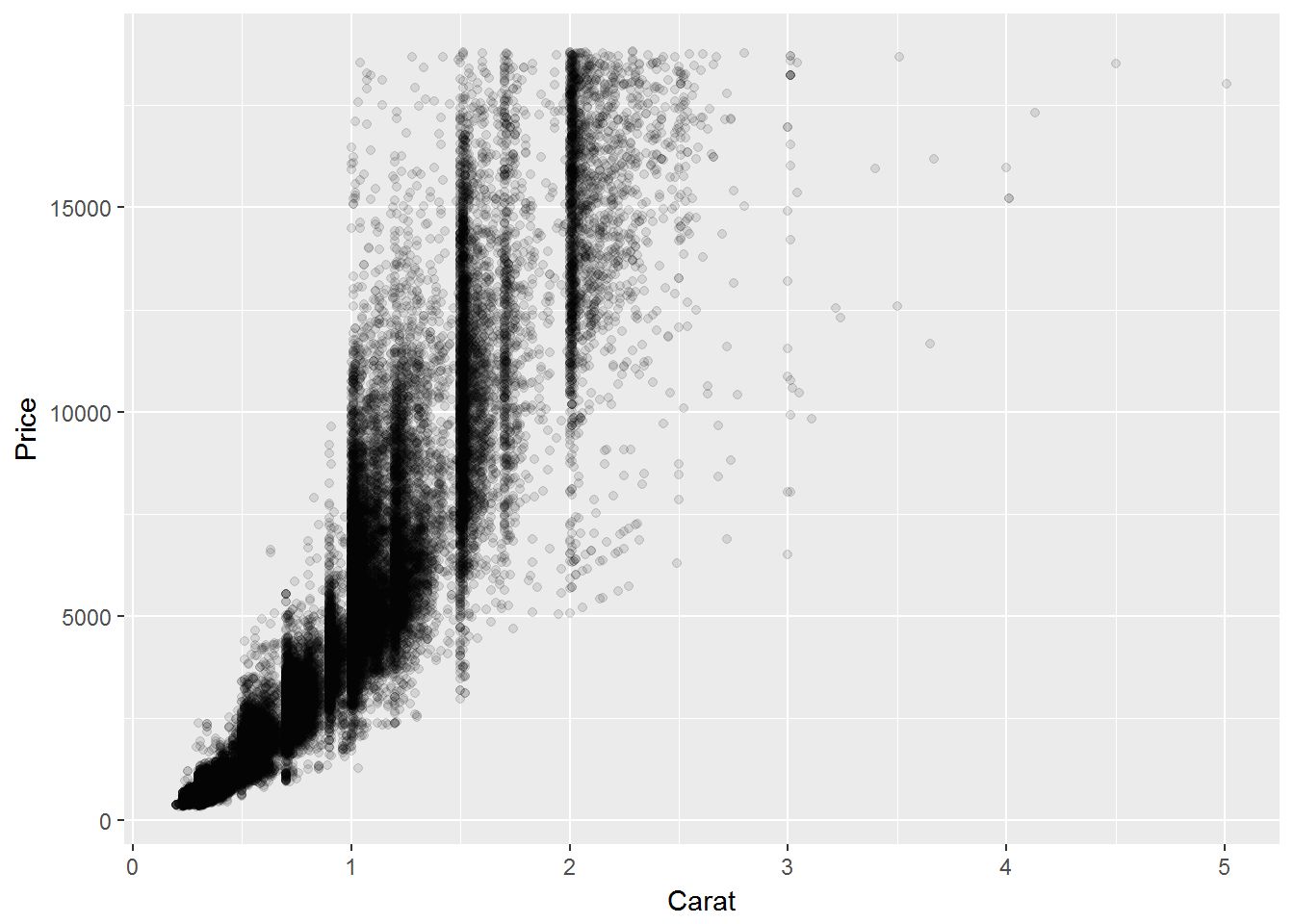
Ah, much better. But what else could be improved? What are the minimum and maximum values in the dataset? Currently we can’t easily see these. Tufte suggests editing the axis to become range bars. With less ink, you convey more information (magic!).
library(ggthemes)## Warning: package 'ggthemes' was built under R version 3.3.3diamonds %>%
ggplot(aes(x = carat, y = price)) + geom_point(alpha = 0.1) +
geom_rangeframe() +
xlab("Carat") +
ylab("Price") +
scale_x_continuous(breaks = extended_range_breaks()(diamonds$carat)) +
scale_y_continuous(breaks = extended_range_breaks()(diamonds$price)) +
theme_tufte() 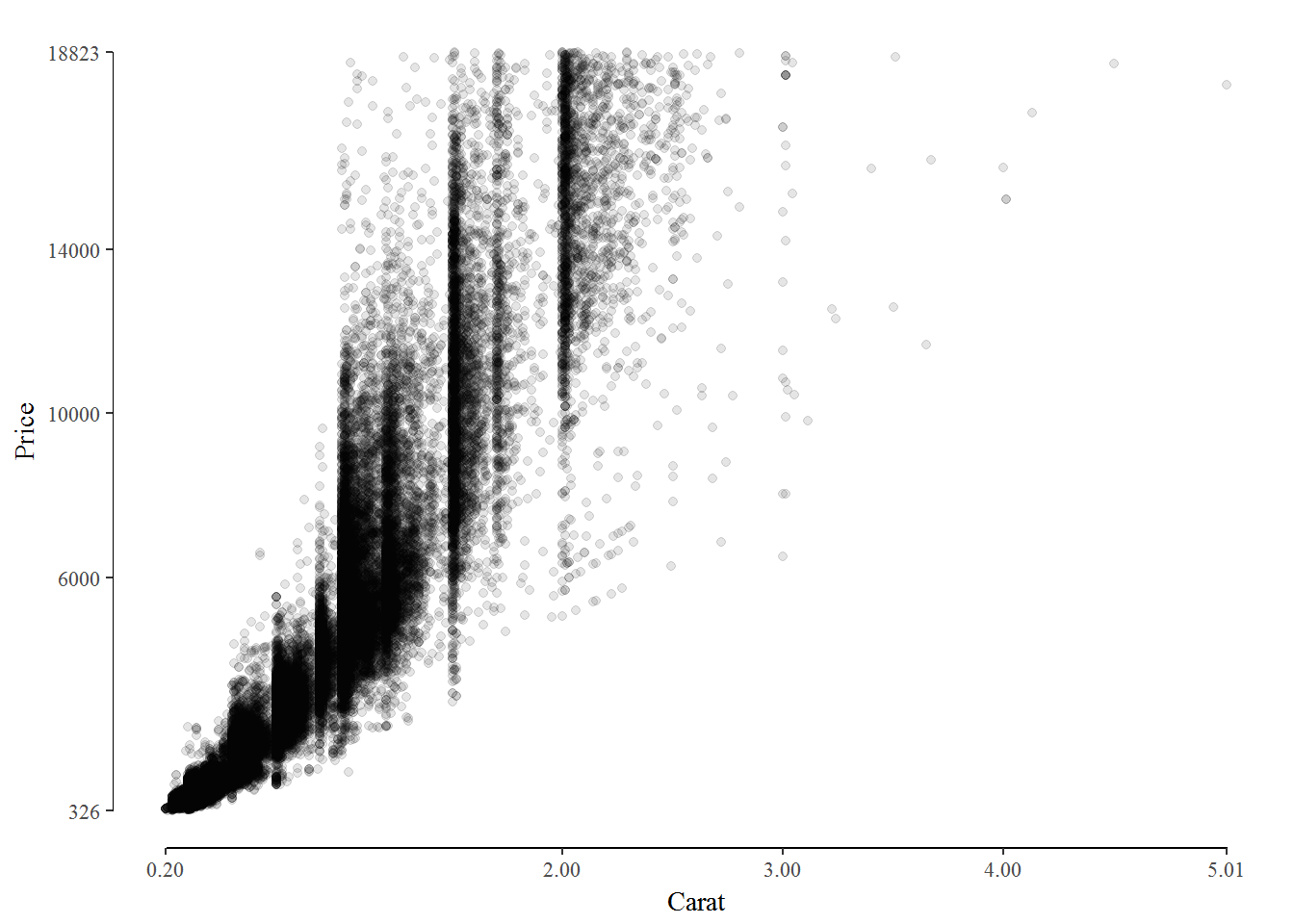
So what’s different in this plot?
- We’ve reduced the overplotting of the points by lowering their alpha level. It’s now more easy to see the density of the points.
- We’ve changed the axis into range bars. It’s now easy to read the range values for the data set
- We’ve stripped out the nonessential ink, such as the background and gridlines.
To do this, we used a few tools included in the ggtheme package.
geom_range()to change the axis into range barstheme_tufte()to remove the background and gridlinesextended_range_breaks()to create axis breaks that include the extreme values of the data.
Conclusion
ggplot2 makes it very easy to produce good looking visualisations. But sometimes less is more. In the Visual Display of Quantative Information, Tufte demonstrates that with a bit of thought, plots can be made even more effective at conveying information. Rather than mixing data with a chart style and “mixing well”, we should envision the end product of what we wish to convey.